Thursday, March 29, 2018

Table Of Contents

I decided to begin creating my table of contents. I went to find some inspiration, because I've never created one before. I came across this article from the website Canva, which is what I’m using to edit. The article was called Designing the Perfect Table of Contents: 50 Examples to Show You How. It was super helpful looking at all the examples that were provided, and It gave me some inspiration.
I came up with 2 layouts


I love both the layouts I came up with. I inorder to decide which one to use I asked a few family members.
They all decided that they liked the first one the best because it is easier to read. I am still not 100%
convinced. I will continue to weigh my options, and decide later.  

Wednesday, March 28, 2018

New Pictures...


A few weeks ago my family and I went to the Miami Boat Show. When we got off the boat I managed to
snap a picture of it. The name of the boat was South Beach Lady (which is perfect for my magazine) and
In the back is the city. That day the weather was amazing, and the water was perfectly blue. I feel like
this picture perfectly captures the ambiance of Miami, which is exactly what I was going for. I have
decided that this picture Is definitely going to be used for the front cover.  


This was the first cover page I created but I was not very happy with It. It was a bit plain and boring so I decided to keep trying.
Soooo, after a while this is what I managed to come up with. I am beyond happy, I personally think it looks like a real magazine. I used a bit of yellow because It makes the letters pop and make it a bit more interesting to look at. I also made the picture a bit darker so that the white font was more legiable.

Saturday, March 24, 2018

Editing!


Today I began to edit my Wynwood pictures. I first tried using the app Blackroom which I had
mentioned in a previous blog post, but I found that I wasn't satisfied with the outcome. I felt that
the filters were very limiting, and I needed something that would allow me control more aspects
of my pictures. My friend recommended that I try using the editing option in the Iphone Photos app.


This truned out to be super helpful, I was able to edit my pictures to be exactly how I wanted.

Wednesday, March 21, 2018

Wynwood

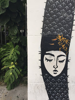
Today I went out to Wynwood with my family! I decided to take a few pictures for my Wynwood section of the Magazine. Looking back I realized that I should have taken a picture of the gate at the entrance that says Wynwood. (oops) I think I might go back just to take one. I picked out my favorite
pictures. I think they relly capture the look and feel of Wynwood. Theyre full of color and they will allow the reader of my magazine to really see the art that the area features.


Im super happy with the pictures I got, I think they turned out pretty cool. Im going to beging to edit them soon!


Tuesday, March 20, 2018

Change of Plans!!

So all my plans have just completely changed. Unfortunately due to a family emergency, I had to reschedule my flight to Atlanta. This in itself has been incredibly stressful, but on top of that I now have to re-plan my whole magazine!!!!!

Image result for stressed gif
It's a good thing I have a plan B and that I love 30 minutes away from a very touristy city! Instead of taking pictures of Atlanta, Ill take pictures in Miami. As I mentioned In my last post I already have a few places in mind that I can use for my magazine. I will begin taking pictures this week!

Sunday, March 18, 2018

Layouts


During class last week my classmates helped me come up with a few new ideas for my front cover.
The last one is definitely my favorite. I really like the cursive font that says “food and Travel”. I think it contrasts super well with the title of the magazine which is super bold. I also really like the fact that it is centered in the middle, and how it aligns with the box that is placed over the picture.

Saturday, March 17, 2018

Filters

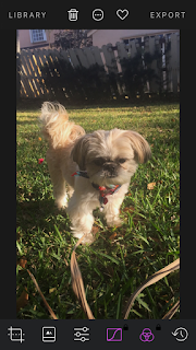
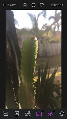
As I mentioned in my last post, a few of my classmates suggested that I began testing out filters to see which ones I like best. I downloaded a few different apps just to try out, and took a few random pictures of things in my backyard to test the apps out on! The app I used for these photos was called Darkroom.


The first filter I used is called A210
Before:

After:

The difference is quite subtle but I like it alot. It makes the picture a bit darker, and makes the colors pop!

This next filter was called A320:
Before:
After:

I really like this filter, It makes the colors super vibrant and makes the lighting look super pretty.

The last filter I tried out was called B153:
Before:


After:

I think this one is definitely my favorite. It makes the picture a bit darker but it really brings out the lightings and the details.

Thursday, March 15, 2018

Critiques

Today in class we got into groups and critique each other's projects.
This was incredibly helpful considering I was feeling a bit stuck. I showed
them the layouts that I had posted a few days ago on my blog. They
picked out the ones they liked best and showed me what they would change.
Over the weekend I will go to Canva and create a new layout. They also
suggested that I interview the chefs/ owners of the restaurants If I get a chance.
I think this would be super cool to include in the magazine. They also suggested
I begin playing around with filters with a few random pictures! I'm definitely going
to take that advice. Im super glad I got a chance to this in class because I received
some really good advice that I think is really going to help!

Sunday, March 11, 2018

Stressss!

I have 2 weeks left before I leave for my trip to Atlanta. I super excited but at the same time a bit nervous
because that leaves me very little time to do my plan B if something goes wrong. Inorder to make sure
everything runs smoothly I need to plan everything out as best as I can. I have decided that I am going to
include 2 restaurants and 2 "cool places" to visit in my magazine.
The first restaurant I will be going to Is a Burger place in Ponce City Market. (they have the best burgers
everrrrr!) I'm still not sure what other restaurant I will be going to but I have some time to think about it. The "cool places" I will include in my magazine are Grant park, and the Beltline which has tons of awesome graffiti.


I am thinking about taking pictures when I go down to Miami and Wynwood and taking pictures there just incase my whole plan falls apart (let's hope not!!)

Saturday, March 10, 2018

New Ideas

Today I was trying to think of ways to make my magazine a bit more interesting. I decided that when I go to take my pictures I will interview a few people who are there to get their personal opinion on the place. For example if I go to a restaurant I will get permission from a person eating there and ask them a few questions, and include it in my magazine. I feel like this makes the magazine a bit more personal and allows the reader to get a realistic opinion of the place. I would also like to inclued a picture of the person in my two page spread.
I thought of a few questions I could ask:


  • What dish did you order
  • Do you eat here often or is this your first time?
    • If so what's your favorite dish
  • Would you recommend this place to others
    • If so why?


I have also realized that there are some negative aspects to this idea. For example, it might be hard finding someone who would want to participate, and I would have to find a way to prove that they gave consent.

Tuesday, March 6, 2018

Playing Around


Over the past few days I have had a hard time with coming up with other ideas for my research.
Sooo I decided to being playing around with a few fonts and layouts on Canva. The title I came up
with for the magazine is "Wander", but I'm not sure if its my favorite. Lets just call it my temporary
title till I can come up with something that I really like. These are just a few Ideas for my layouts:
(The pictures are temporary also, they are from Canva!)


Cover Page-


At the moment the second one is definitely my favorite, but I think it really depends on what works best with the pictures I get.

Table Of Contents:


2 page spread:


I cant wait till I take all my pictures!!

Sunday, March 4, 2018

Inspiration


Today I decided to begin looking for inspiration for my magazine. I came across an awesome website
called Kelly Flood food and travel. This website was created by a woman named Kelly who has been
a graphic designer for over 20 years. She has traveled all around the world and creates magazines
based off her experiences! Her designs are stunning! Here are a few examples:


I am obsessed with the unique layout of the picture and the use of different fonts and colors. The whole
spread is simple and allows the readers eye to flow easily across the page. I am super inspired by her
work.
I've also began to plan the places that I would like to feature in my magazine. The Botanical Gardens
is definitely top on my list, the flowers are a beautiful and will give my magazine a nice pop of color.
Zoo Atlanta is another place I am definitely considering featuring. Ponce city Market is one of my favorite
places to visit in Atlanta, it has a ton of cute and unique boutiques, as well as some of the tastiest food
I have ever had. This would be where I would take most of my food pictures.


Final Results!!

Here it is, what you have all been waiting for! Poster :  Documentary : https://drive.google.com/file/d/1ls-FOYRgx64tKSduFEaUuIDxoaV2XDHk...